
Child development_il
Child development_il
Child
development_il
A comprehensive platform for knowledge, enrichment, and integrated online courses — designed for Israel’s national association for child development.
Ownership
UX-UI Design
Information Architecture
Web Design
Prototyping
Handoff
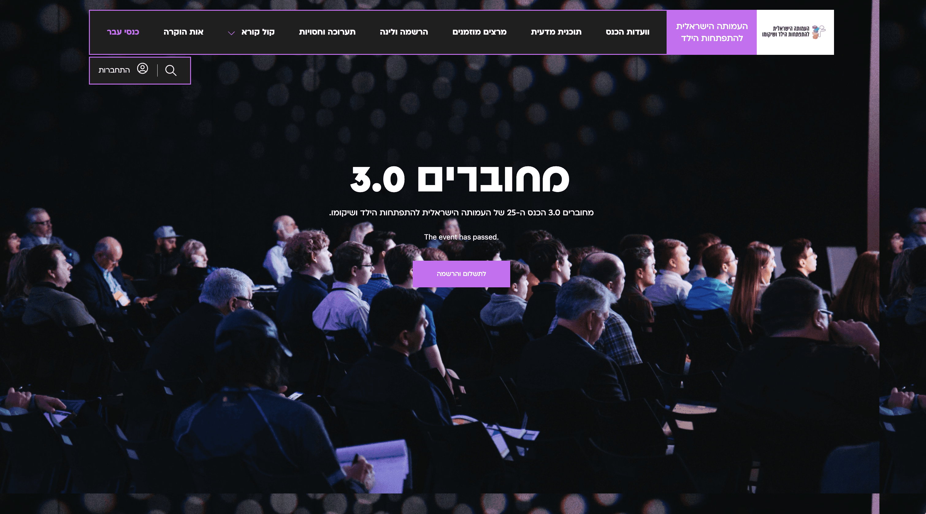
The Israeli Association for Child Development
and Rehabilitation needed a website that would reflect
its professional authority while remaining accessible
to a broad audience — from therapists and physicians
to parents seeking guidance.
I led the UX and UI design of the site from the ground up.
The Israeli Association for Child Development and Rehabilitation needed a website that would reflect its professional authority while remaining accessible to a broad audience — from therapists and physicians to parents seeking guidance.
I led the UX and UI design of the site from the ground up.

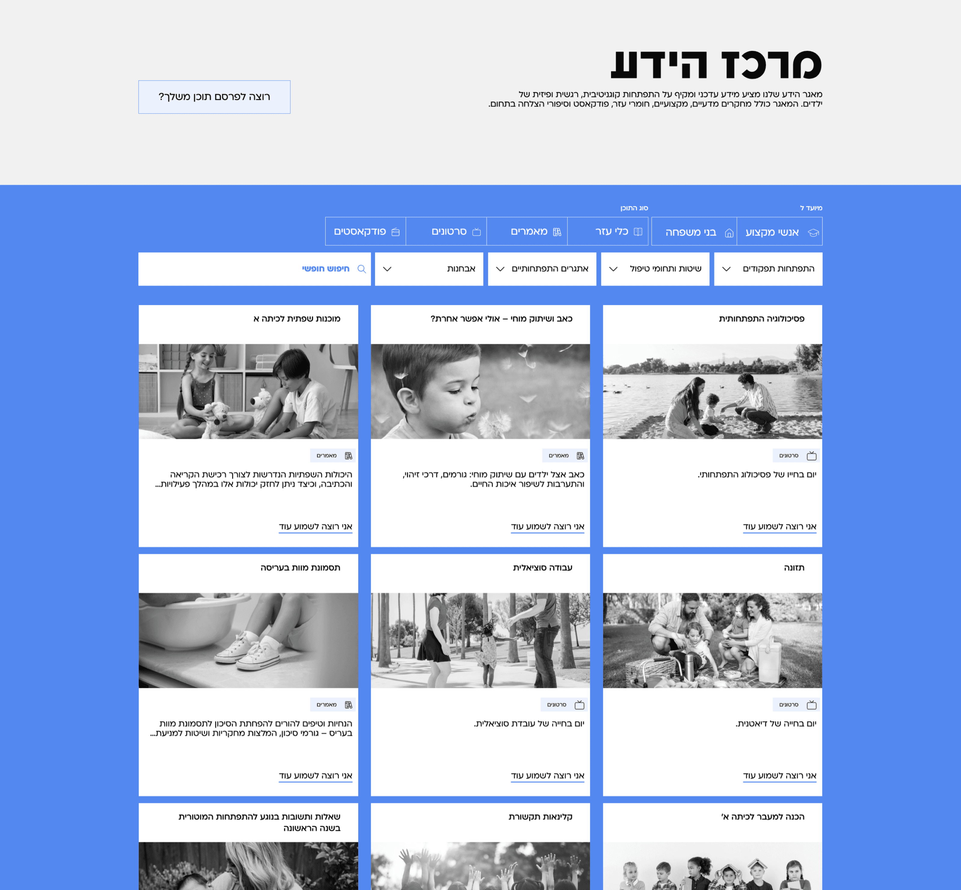
The Problem
The association needed a website that could serve multiple audiences — professionals, parents, and students — while also functioning as a central hub for internal knowledge, public resources, and a fully integrated online course system.
The real challenge was organizing a vast amount of content and presenting it in a way that would feel natural, clear, and easy
to navigate — without overwhelming the user or fragmenting the experience.
In addition, the platform had to be scalable, accessible, and visually aligned with the association’s values of professionalism,
care, and clarity.
The association needed a website that could serve multiple audiences — professionals, parents, and students — while also functioning as a central hub for internal knowledge, public resources, and a fully integrated online course system.
The real challenge was organizing a vast amount of content and presenting it in a way that would feel natural, clear, and easy
to navigate — without overwhelming the user or fragmenting the experience. In addition, the platform had to be scalable, accessible, and visually aligned with the association’s values of professionalism, care, and clarity.
The association needed a website that could serve multiple audiences — professionals, parents, and students — while also functioning as a central hub for internal knowledge, public resources, and a fully integrated online course system.
The real challenge was organizing a vast amount of content and presenting it in a way that would feel natural, clear, and easy to navigate — without overwhelming the user or fragmenting the experience. In addition, the platform had to be scalable, accessible,
and visually aligned with the association’s values of professionalism, care, and clarity.
The Solution
I approached the project by first building
a clear information architecture, organizing the content into intuitive, user-focused pathways. I defined distinct entry points for each audience type and designed a flexible navigation system that works across both the main site and its internal sub-sites.
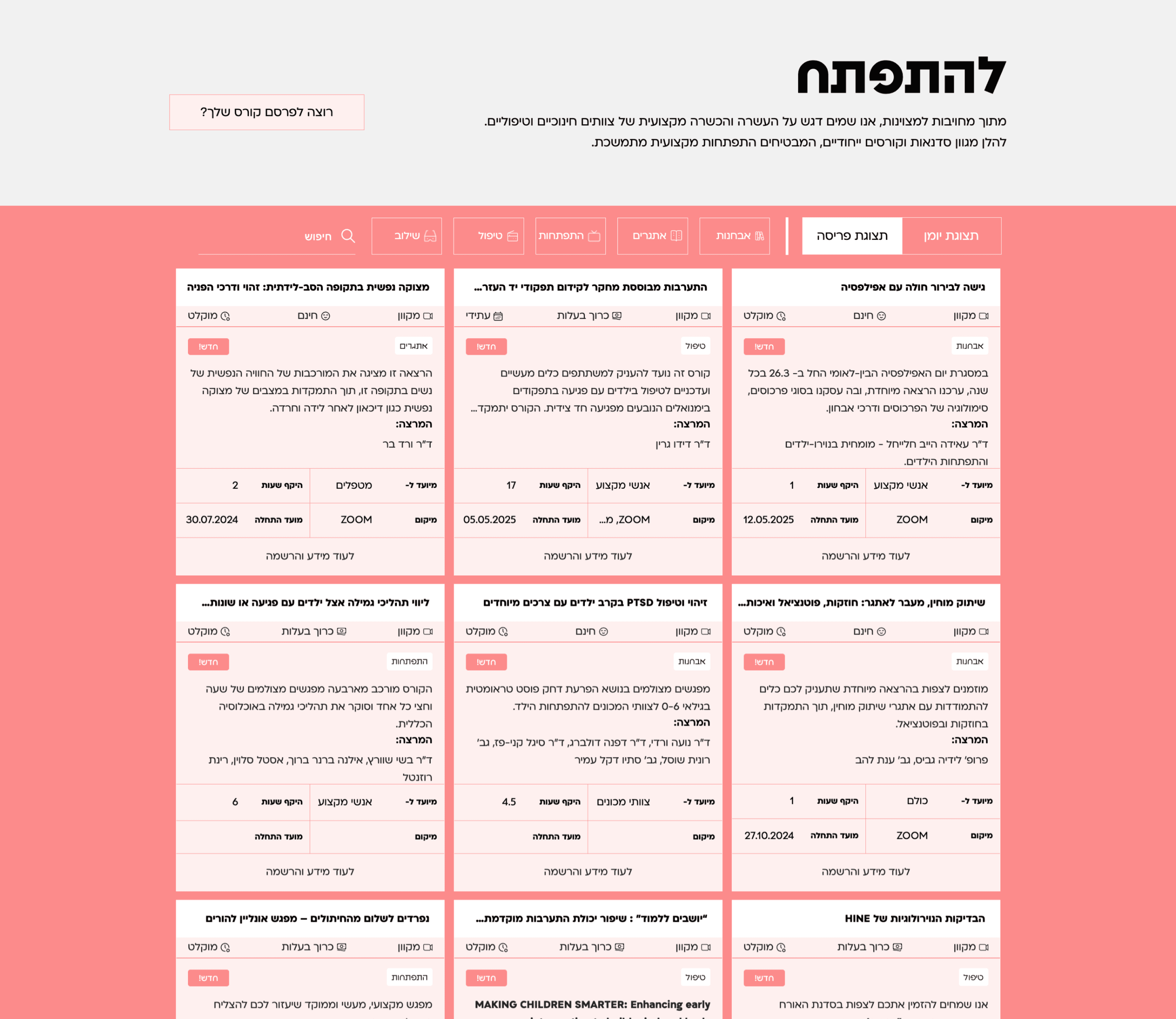
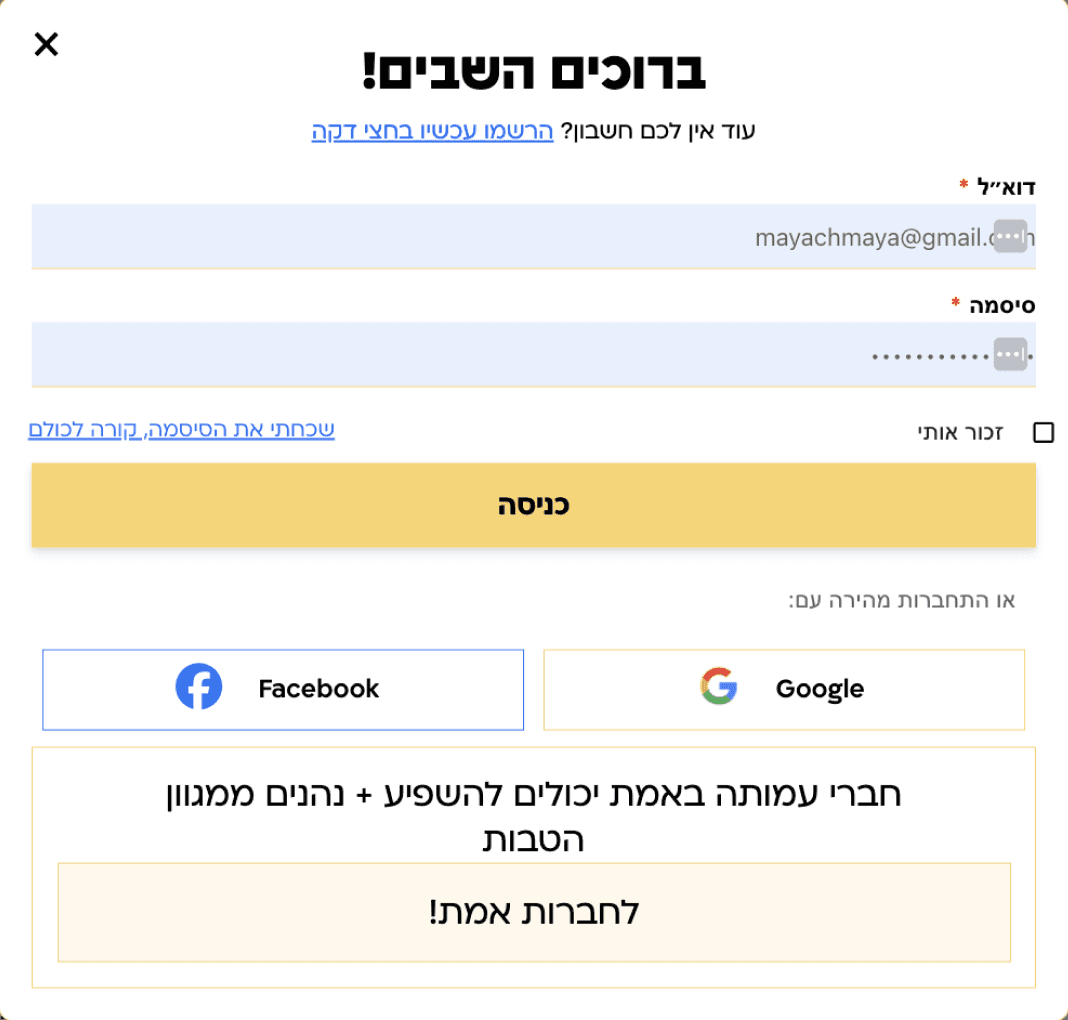
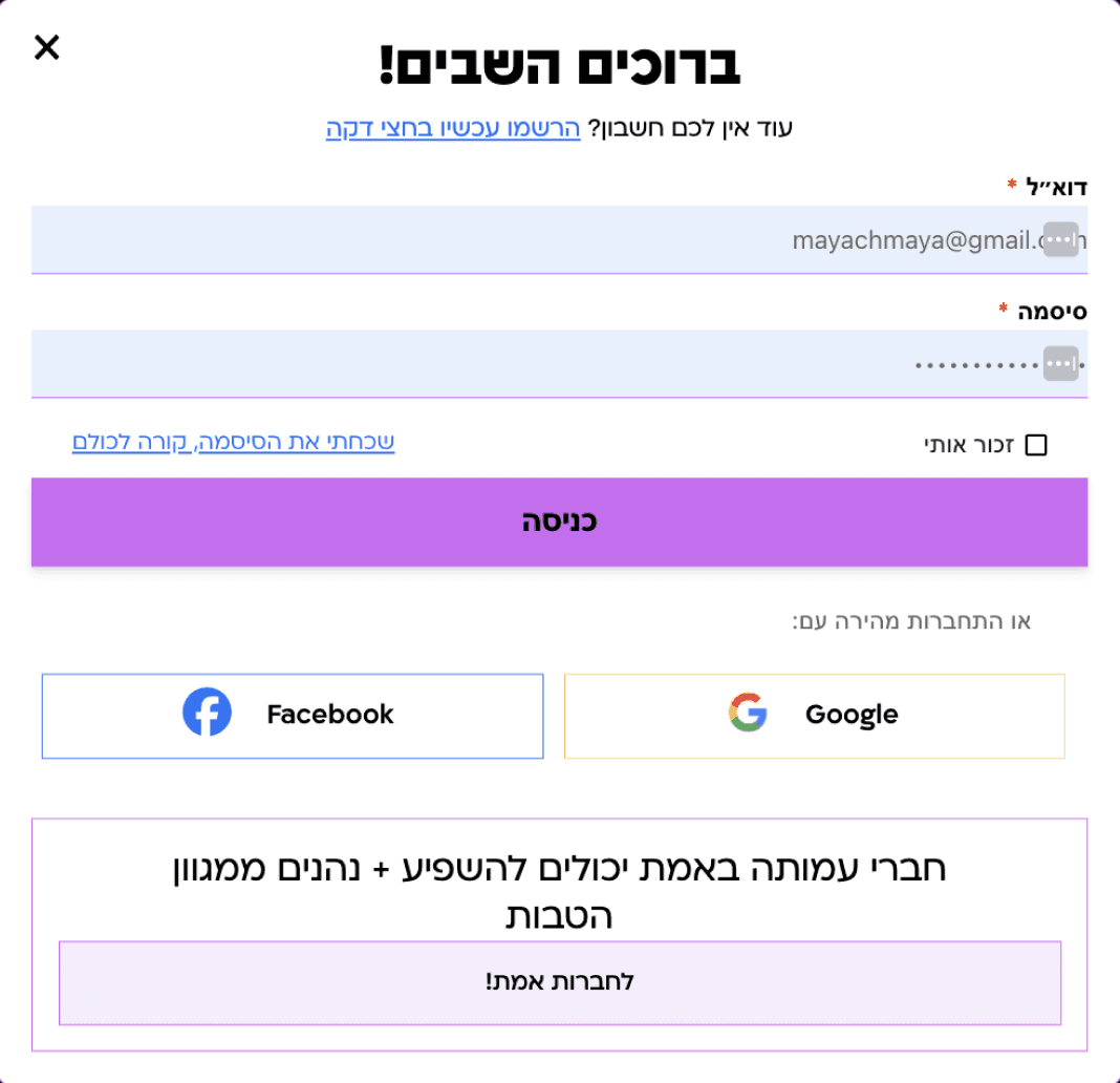
To prevent the platform from feeling fragmented, I established a unified visual language and interaction model — ensuring that whether users were reading professional guidelines, browsing courses, or accessing family support materials, the experience remained seamless and familiar.
To prevent the platform from feeling fragmented, I established a unified visual language and interaction model — ensuring that whether users were reading professional guidelines, browsing courses, or accessing family support materials, the experience remained seamless and familiar.
To prevent the platform from feeling fragmented, I established a unified visual language and interaction model — ensuring that whether users were reading professional guidelines, browsing courses, or accessing family support materials, the experience remained seamless and familiar.
This foundation allowed for both clarity and scalability, enabling the association to grow its content offering without sacrificing usability or consistency.
This foundation allowed for both clarity and scalability, enabling the association to grow its content offering without sacrificing
usability or consistency.
*** Proudly designed in collaboration with Vonoteam — combining strategic thinking with thoughtful execution***
*** Proudly designed in collaboration with Vonoteam — combining strategic thinking with thoughtful execution***
*** Proudly designed in collaboration with Vonoteam — combining strategic thinking with thoughtful execution***
See it live
The Solution
I approached the project by first building a clear information architecture, organizing the content into intuitive, user-focused pathways. I defined distinct entry points for each audience type and designed a flexible navigation system that works across both the main site and its internal sub-sites.
I approached the project by first building a clear information architecture, organizing the content into intuitive, user-focused pathways. I defined distinct entry points for each audience type and designed a flexible navigation system that works across both the main site and its internal sub-sites.